
Designing website advertising: pay for the results you want
Introduction: Problem Statement
Currently through Bright Network’s employer platform clients could run email campaigns to promote jobs to candidates, but there was no equivalent way to promote a specific job listing within the website experience itself. To expand our commercial offering we decided to branch into website advertising. This new feature aimed to surface promoted roles more prominently, ensuring they appeared first on job listing pages.
Email campaigns were sold using a simple commercial model based on “sends,” or the number of emails delivered to candidates. For website advertising, we wanted to experiment with a similarly straightforward unit of purchase. We chose to sell “conversions,” defined as the number of users who clicked through to a job and applied as a direct result of the advert. This approach was intentionally bold and experimental, as no major competitors were selling job advertising based on outcomes rather than exposure or time.
Understanding Our Clients
Although Bright Network worked with many large, well-known employers, the individual users of the platform were typically not advertising specialists but worked in HR or graduate recruitment roles.
- They typically used a wide range of tools and platforms throughout their day. Their willingness or capacity for learning complex new systems was limited.
- Few were power-users who asked for advanced features, but the majority of clients prioritised speed and ease of use.
- Many also relied on the Bright Network Customer Success team to set up campaigns on their behalf, although there was a broader organisational push towards self-serve tooling and better onboarding.
These constraints made it clear early on that simplicity would be critical to the success of the product. It was also important that the experience felt familiar and aligned closely with the existing email campaign interface, reducing the learning curve and increasing confidence for less technical users.
Proposed Solution
A multi-step workflow was chosen with breadcrumbs moving you through each step.
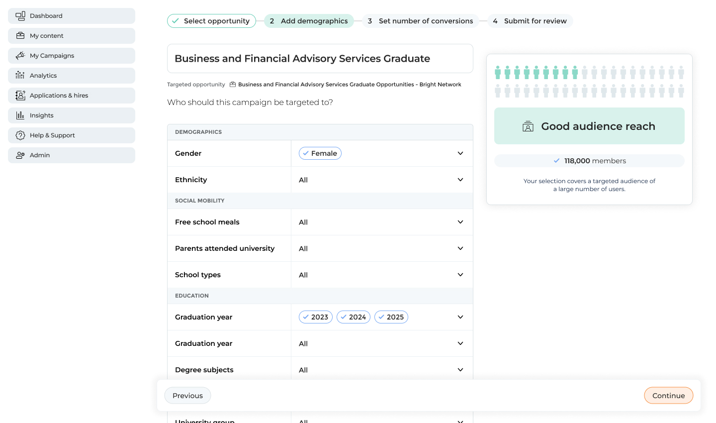
Users first selected the job they wanted to promote, followed by a simple demographic selection step. All demographic options were fully exposed rather than hidden behind nested menus, making it easy to see what had been selected and what still needed input.
To help users understand the impact of their targeting choices, audience reach was displayed as an infographic-style visualisation.
Next, users set their desired number of conversions. The system dynamically constrained minimum and maximum values based on the selected audience size, ensuring that targets were achievable.
Finally, users selected the campaign timings and reviewed a summary of their choices before launch.

Audience selection page with demographic filters and visualised audience reach
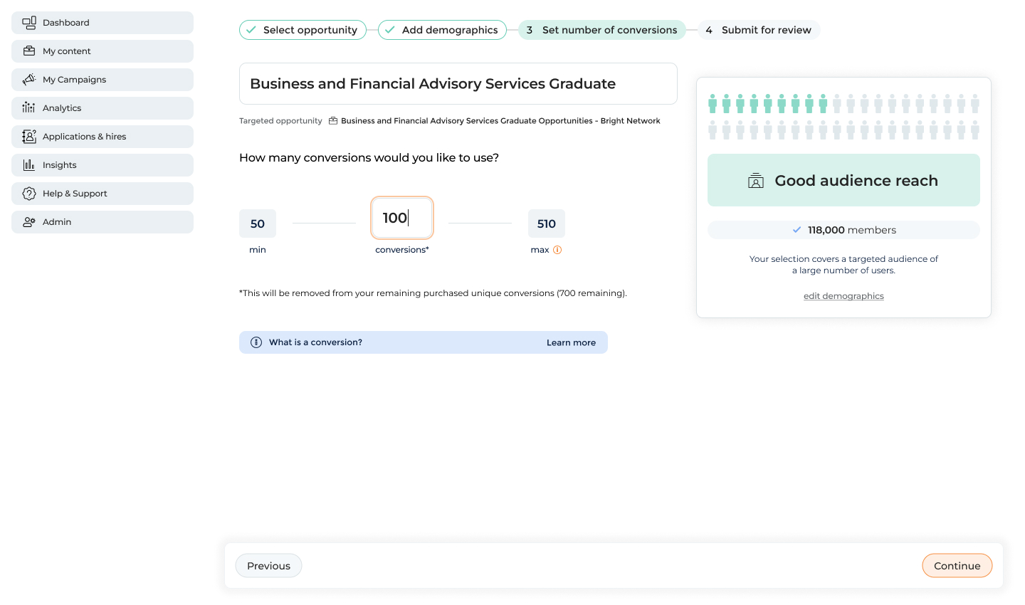
Selecting the number of conversions
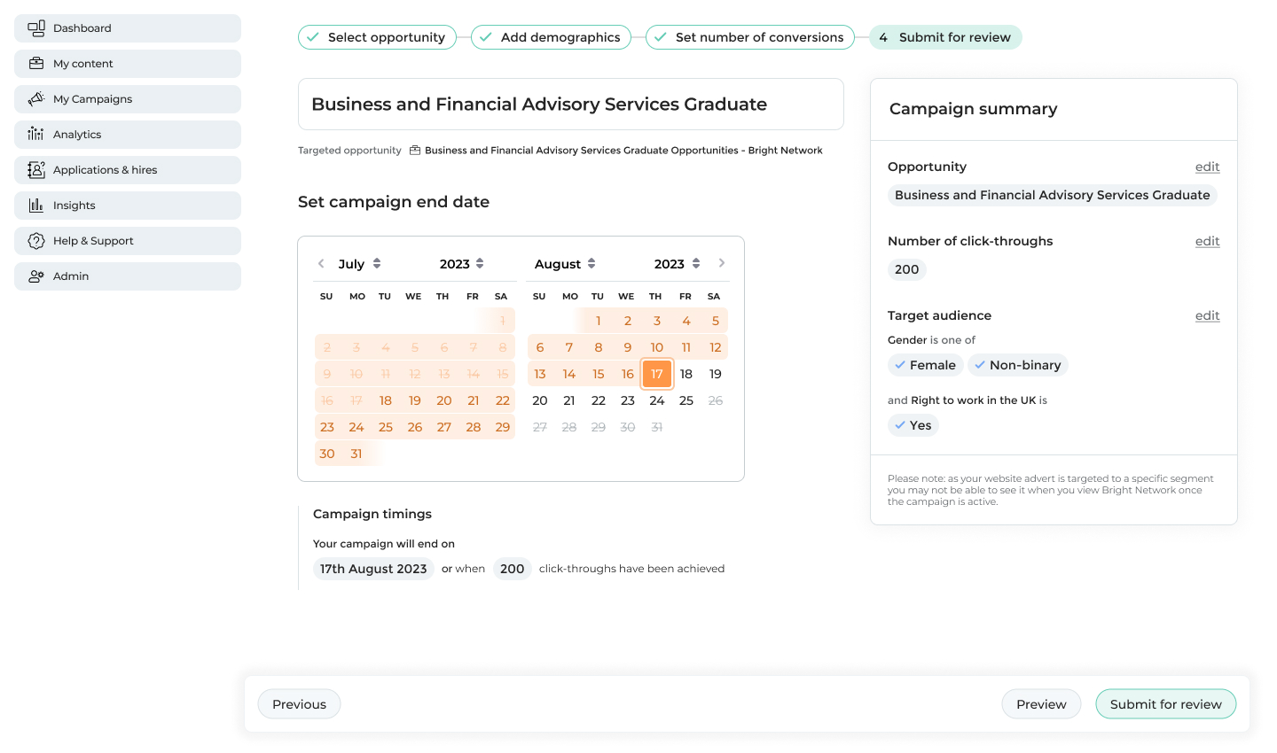
Setting the campaign timings and viewing a summary of all prior selections
From a technical perspective, the order of these steps was critical. Because conversions were dependent on audience size and timing, we implemented careful validation and error handling to prevent users from moving through the workflow in a way that would make targets unachievable.
Initial Testing
We worked closely with the Customer Success and Commercial teams throughout development, leveraging their deep understanding of client needs and their role in explaining the pricing model. Multiple rounds of user testing were conducted, with these teams on hand, to validate both individual components and the overall workflow:
- An initial round of testing with four participants focused on the demographic selection experience.
- A second round with a further four participants to evaluate the end-to-end workflow.
- Finally, we tested with three participants who were not existing clients to assess whether the interface was understandable without prior platform familiarity.
Some top highlights from these sessions were:
- Demographic filtering was simple for most users. They appreciated that all options were exposed and that it’s clear what’s been filled and what has not.
- The audience reach visualisation was loved by participants and understandable in relation to the demographic filters.
- However, terminology emerged as a key issue, with many users unsure of the difference between a “conversion” and a “click-through”, highlighting the need for clearer language and supporting copy.
“I like that I can see everything straight away. For me I’d always like to see the options while they are fresh in my mind”
•
Finance company, intermediate user, user testing interview
“I love the graphic in the top right. Love that it’s an instant visualisation of the people we can reach from the drop downs. Really lovely to see that visualised.”
•
Accounting company, intermediate user, user testing interview
Once the product reached a beta stage, we tested again with seven participants using real job postings and actual conversion credits. Improved copy helped clarify expectations, usability issues were resolved, and all test campaigns were successfully launched without major bugs. This allowed us to proceed with a soft launch to a wider client group for one full campaign season.
“Yeah, so a conversion is… I’m buying 100 clicks onto the apply button basically.”
•
Media company, in-experienced user, user testing interview
Findings Post-Launch
After one campaign season, it became clear that many campaigns were failing to reach their conversion targets. This was largely due to:
- Low traffic to certain job types (ie. industrial placements) and locations (jobs outside of London) leading to little engagement
- Some demographics not having enough engaged users despite what the algorithm estimated.
- And with these paired together we learned that promising conversions was fundamentally flawed. While we could estimate likelihood, we could not guarantee outcomes.
As a result, the commercial model was revised to sell advertising based on timeframes, measured in weeks, while still showing conversion estimates as guidance rather than guarantees.
Although the original model was not successful, the project generated valuable insights and data that clearly demonstrated why outcome-based pricing was not viable in this context. Importantly, website advertising itself proved popular, with 28 clients onboarding in the first season and many continuing their spend into subsequent campaigns despite mixed results. This validated the underlying product concept and informed future iterations built on more realistic expectations.
28
clients onboarded
£180k
revenue 1st season
14000
total new conversions
Contact
Return to home
© Jo Watt
Designing website advertising: pay for the results you want
Introduction: Problem Statement
Currently through Bright Network’s employer platform clients could run email campaigns to promote jobs to candidates, but there was no equivalent way to promote a specific job listing within the website experience itself. To expand our commercial offering we decided to branch into website advertising. This new feature aimed to surface promoted roles more prominently, ensuring they appeared first on job listing pages.
Email campaigns were sold using a simple commercial model based on “sends,” or the number of emails delivered to candidates. For website advertising, we wanted to experiment with a similarly straightforward unit of purchase. We chose to sell “conversions,” defined as the number of users who clicked through to a job and applied as a direct result of the advert. This approach was intentionally bold and experimental, as no major competitors were selling job advertising based on outcomes rather than exposure or time.
Understanding Our Clients
Although Bright Network worked with many large, well-known employers, the individual users of the platform were typically not advertising specialists but worked in HR or graduate recruitment roles.
- They typically used a wide range of tools and platforms throughout their day. Their willingness or capacity for learning complex new systems was limited.
- Few were power-users who asked for advanced features, but the majority of clients prioritised speed and ease of use.
- Many also relied on the Bright Network Customer Success team to set up campaigns on their behalf, although there was a broader organisational push towards self-serve tooling and better onboarding.
These constraints made it clear early on that simplicity would be critical to the success of the product. It was also important that the experience felt familiar and aligned closely with the existing email campaign interface, reducing the learning curve and increasing confidence for less technical users.
Proposed Solution
A multi-step workflow was chosen with breadcrumbs moving you through each step.
Users first selected the job they wanted to promote, followed by a simple demographic selection step. All demographic options were fully exposed rather than hidden behind nested menus, making it easy to see what had been selected and what still needed input.
To help users understand the impact of their targeting choices, audience reach was displayed as an infographic-style visualisation.
Next, users set their desired number of conversions. The system dynamically constrained minimum and maximum values based on the selected audience size, ensuring that targets were achievable.
Finally, users selected the campaign timings and reviewed a summary of their choices before launch.
Audience selection page with demographic filters and visualised audience reach
Selecting the number of conversions
Setting the campaign timings and viewing a summary of all prior selections
From a technical perspective, the order of these steps was critical. Because conversions were dependent on audience size and timing, we implemented careful validation and error handling to prevent users from moving through the workflow in a way that would make targets unachievable.
Initial Testing
We worked closely with the Customer Success and Commercial teams throughout development, leveraging their deep understanding of client needs and their role in explaining the pricing model. Multiple rounds of user testing were conducted, with these teams on hand, to validate both individual components and the overall workflow:
- An initial round of testing with four participants focused on the demographic selection experience.
- A second round with a further four participants to evaluate the end-to-end workflow.
- Finally, we tested with three participants who were not existing clients to assess whether the interface was understandable without prior platform familiarity.
Some top highlights from these sessions were:
- Demographic filtering was simple for most users. They appreciated that all options were exposed and that it’s clear what’s been filled and what has not.
- The audience reach visualisation was loved by participants and understandable in relation to the demographic filters.
- However, terminology emerged as a key issue, with many users unsure of the difference between a “conversion” and a “click-through”, highlighting the need for clearer language and supporting copy.
“I like that I can see everything straight away. For me I’d always like to see the options while they are fresh in my mind”
•
Finance company, intermediate user, user testing interview
“I love the graphic in the top right. Love that it’s an instant visualisation of the people we can reach from the drop downs. Really lovely to see that visualised.”
•
Accounting company, intermediate user, user testing interview
Once the product reached a beta stage, we tested again with seven participants using real job postings and actual conversion credits. Improved copy helped clarify expectations, usability issues were resolved, and all test campaigns were successfully launched without major bugs. This allowed us to proceed with a soft launch to a wider client group for one full campaign season.
“Yeah, so a conversion is… I’m buying 100 clicks onto the apply button basically.”
•
Media company, in-experienced user, user testing interview
Findings Post-Launch
After one campaign season, it became clear that many campaigns were failing to reach their conversion targets. This was largely due to:
- Low traffic to certain job types (ie. industrial placements) and locations (jobs outside of London) leading to little engagement
- Some demographics not having enough engaged users despite what the algorithm estimated.
- And with these paired together we learned that promising conversions was fundamentally flawed. While we could estimate likelihood, we could not guarantee outcomes.
As a result, the commercial model was revised to sell advertising based on timeframes, measured in weeks, while still showing conversion estimates as guidance rather than guarantees.
Although the original model was not successful, the project generated valuable insights and data that clearly demonstrated why outcome-based pricing was not viable in this context. Importantly, website advertising itself proved popular, with 28 clients onboarding in the first season and many continuing their spend into subsequent campaigns despite mixed results. This validated the underlying product concept and informed future iterations built on more realistic expectations.
28
clients onboarded
£180k
revenue 1st season
14000
total new conversions
Contact
Return to home
© Jo Watt

Designing website advertising: pay for the results you want
Introduction: Problem Statement
Currently through Bright Network’s employer platform clients could run email campaigns to promote jobs to candidates, but there was no equivalent way to promote a specific job listing within the website experience itself. To expand our commercial offering we decided to branch into website advertising. This new feature aimed to surface promoted roles more prominently, ensuring they appeared first on job listing pages.
Email campaigns were sold using a simple commercial model based on “sends,” or the number of emails delivered to candidates. For website advertising, we wanted to experiment with a similarly straightforward unit of purchase. We chose to sell “conversions,” defined as the number of users who clicked through to a job and applied as a direct result of the advert. This approach was intentionally bold and experimental, as no major competitors were selling job advertising based on outcomes rather than exposure or time.
Understanding Our Clients
Although Bright Network worked with many large, well-known employers, the individual users of the platform were typically not advertising specialists but worked in HR or graduate recruitment roles.
- They typically used a wide range of tools and platforms throughout their day. Their willingness or capacity for learning complex new systems was limited.
- Few were power-users who asked for advanced features, but the majority of clients prioritised speed and ease of use.
- Many also relied on the Bright Network Customer Success team to set up campaigns on their behalf, although there was a broader organisational push towards self-serve tooling and better onboarding.
These constraints made it clear early on that simplicity would be critical to the success of the product. It was also important that the experience felt familiar and aligned closely with the existing email campaign interface, reducing the learning curve and increasing confidence for less technical users.
Proposed Solution
A multi-step workflow was chosen with breadcrumbs moving you through each step.
Users first selected the job they wanted to promote, followed by a simple demographic selection step. All demographic options were fully exposed rather than hidden behind nested menus, making it easy to see what had been selected and what still needed input.
To help users understand the impact of their targeting choices, audience reach was displayed as an infographic-style visualisation.
Next, users set their desired number of conversions. The system dynamically constrained minimum and maximum values based on the selected audience size, ensuring that targets were achievable.
Finally, users selected the campaign timings and reviewed a summary of their choices before launch.
Audience selection page with demographic filters and visualised audience reach
Selecting the number of conversions
Setting the campaign timings and viewing a summary of all prior selections
From a technical perspective, the order of these steps was critical. Because conversions were dependent on audience size and timing, we implemented careful validation and error handling to prevent users from moving through the workflow in a way that would make targets unachievable.
Initial Testing
We worked closely with the Customer Success and Commercial teams throughout development, leveraging their deep understanding of client needs and their role in explaining the pricing model. Multiple rounds of user testing were conducted, with these teams on hand, to validate both individual components and the overall workflow:
- An initial round of testing with four participants focused on the demographic selection experience.
- A second round with a further four participants to evaluate the end-to-end workflow.
- Finally, we tested with three participants who were not existing clients to assess whether the interface was understandable without prior platform familiarity.
Some top highlights from these sessions were:
- Demographic filtering was simple for most users. They appreciated that all options were exposed and that it’s clear what’s been filled and what has not.
- The audience reach visualisation was loved by participants and understandable in relation to the demographic filters.
- However, terminology emerged as a key issue, with many users unsure of the difference between a “conversion” and a “click-through”, highlighting the need for clearer language and supporting copy.
“I like that I can see everything straight away. For me I’d always like to see the options while they are fresh in my mind”
•
Finance company, intermediate user, user testing interview
“I love the graphic in the top right. Love that it’s an instant visualisation of the people we can reach from the drop downs. Really lovely to see that visualised.”
•
Accounting company, intermediate user, user testing interview
Once the product reached a beta stage, we tested again with seven participants using real job postings and actual conversion credits. Improved copy helped clarify expectations, usability issues were resolved, and all test campaigns were successfully launched without major bugs. This allowed us to proceed with a soft launch to a wider client group for one full campaign season.
“Yeah, so a conversion is… I’m buying 100 clicks onto the apply button basically.”
•
Media company, in-experienced user, user testing interview
Findings Post-Launch
After one campaign season, it became clear that many campaigns were failing to reach their conversion targets. This was largely due to:
- Low traffic to certain job types (ie. industrial placements) and locations (jobs outside of London) leading to little engagement
- Some demographics not having enough engaged users despite what the algorithm estimated.
- And with these paired together we learned that promising conversions was fundamentally flawed. While we could estimate likelihood, we could not guarantee outcomes.
As a result, the commercial model was revised to sell advertising based on timeframes, measured in weeks, while still showing conversion estimates as guidance rather than guarantees.
Although the original model was not successful, the project generated valuable insights and data that clearly demonstrated why outcome-based pricing was not viable in this context. Importantly, website advertising itself proved popular, with 28 clients onboarding in the first season and many continuing their spend into subsequent campaigns despite mixed results. This validated the underlying product concept and informed future iterations built on more realistic expectations.
28
clients onboarded
£180k
revenue 1st season
14000
total new conversions
© Jo Watt