
Reinventing the animation timeline: balancing simplicity and precision
Problem Context
In 2021 I worked on a legacy ad-creation tool that was being used by large advertising customers to build rich, interactive display ads. The tool supported advanced capabilities such as animation timelines and bespoke code, allowing users to create highly customised creatives.
In practice, however, the experience had fallen behind modern standards. The interface was dated, difficult to use, and did not match established patterns seen in other professional tools. As a result, the product struggled to attract new customers outside its existing ecosystem and was at risk of becoming irrelevant for experienced designers.
The goal of this project was to re-invent the ad-creation experience from the ground up, making it appealing to a broader audience while retaining the depth required by expert users. This case study focuses specifically on redesigning the animation timeline, one of the most powerful but least usable parts of the tool.
Understanding our Customers
We needed to design for three distinct customer groups with very different needs and expectations:
- Established brands who have a strong brand identity and a significant advertising budget. They may employ in-house designers or use an agency.
- Design agencies who employ experienced designers who were fluent in professional creative tools and expect precision and control.
- Small businesses were not current customers but represented a strategic opportunity as the product direction shifted towards more self-serve workflows.
I conducted user interviews with existing customers which helped to highlight consistent issues with the current animation timeline. Many users struggled to even find the timeline within the interface, and once discovered, it offered limited flexibility and control. The timeline did not resemble industry-standard animation tools, making it difficult to understand what was happening over time or how animations were constructed.
“Instead of applying a preset animation I would prefer to be able to create one from scratch; to be able to edit in time the position, movement, opacity, rotation, time duration, revealing effects, stuff like this.”
•
Existing customer, user interview
“Animation is very difficult to follow and there is no timeline preview to be able to scroll back and forth to see your animations play.”
•
Existing customer, user interview
From this research, I defined several guiding principles for the redesign.
- Standardisation: The new timeline needed to follow established interaction patterns rather than inventing new ones, reducing confusion for experienced designers.
- Reusability: Encourage reusability through duplication, templates, and saved assets.
- Libraries: Prebuilt components should handle common use cases quickly, as most ads are relatively simple.
- Error detection: Validation needed to be clear and documentation was vital, particularly given strict ad weights and specifications.
- Precision: Accuracy and customisation was important for expert users creating bespoke animations.
The Solution
The core challenge was designing a system that felt approachable to new users while still offering the depth and precision expected by professionals. To achieve this, I came up with a concept that allowed users to design at different levels of complexity depending on their needs.
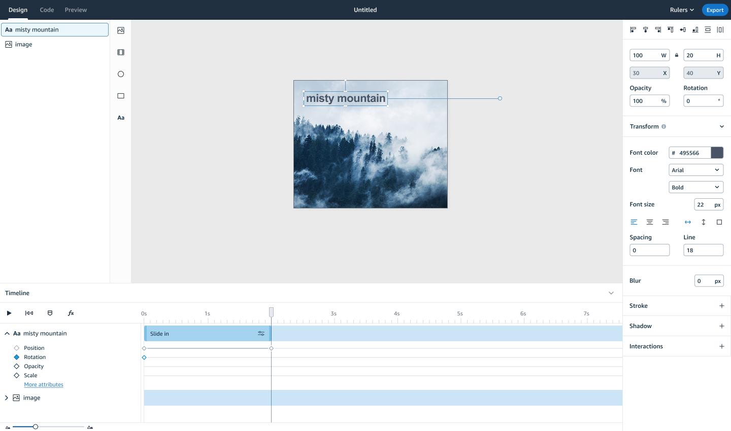
Animations were built using three interconnected concepts: effects, keyframes, and code.
Effects acted as reusable bundles of keyframes that covered common animation patterns. They could be dragged onto the timeline, resized to adjust duration, and repositioned to control start and end times. This made simple animations quick to create and easy to iterate on.
For users who needed more control, effects could be expanded to reveal the underlying keyframes. Keyframes provided precise control over individual properties and behaved in a way that was familiar to users of professional animation tools.
At the deepest level, all animations mapped directly to web-friendly code, ensuring transparency and accuracy. This one-to-one relationship reduced errors ensuring it would render correctly across all browsers.

Using keyframes on the animation timeline
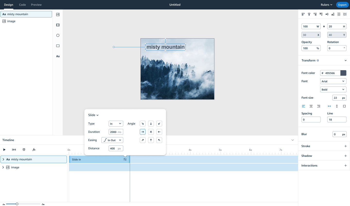
The simplified effects interface
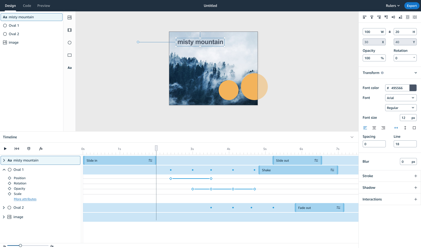
A complete view of using keyframes and effects in a project
The above solution was truly unique, in that competitor tools had both effects and keyframes but they did not have a relationship to one another.
Validation and Usability Testing
I conducted usability testing with five existing users of the tool to validate the concept and interaction patterns. From these sessions I learned that:
- All participants understood the relationship between effects and keyframes, which was an encouraging given the uniqueness of this concept.
- Simplicity and familiarity consistently emerged as key themes
- 4 out of 5 participants were able to create and edit keyframes independently.
Early testing did reveal friction around discoverability. Several users struggled to understand how to add effects or reveal keyframes, this led to iterations with the iconography used, and when testing future iterations this was no longer an issue. Feedback also highlighted a desire for more control over effects without needing to edit individual keyframes, which resulted in the introduction of an effect editor that gave users control over properties like direction, easing, and distance.
Later in the project, I was able to test the design in production using an early alpha build.
- Unfortunately some features were not implemented (ie. moving keyframes) which led to frustration with users
- We learned that customer expectations are high when coming from expert animation tools, and patience for clunkiness was low.
- Early testing of this build, while valuable, was ultimately brought down by technical glitches
“Overall, I really like it. There are some issues though. The ability to move or delete things in the timeline, if they can’t get resolved and match the likes of Adobe, then it might be an issue.”
•
Existing customer, user testing interview
“It is so much better than before. Less effort is required to create animations because of the timeline.”
•
Existing customer, user testing interview
Outcomes and Learnings
Ultimately we learned that there was a strong appetite for the underlying concept of building animations in this way. Whilst alpha testing raised a lot of limitations with the tool, Beta testing showed slight improvements and showed that as we fixed the technical issues the tool became a lot friendlier to use.
Future plans included improving quality-of-life features such as snapping, keyboard shortcuts, and other expected features which designers were struggling to use the tool without. We planned to introduce templates and component libraries to reduce repetitive work. Broader integrations with adjacent advertising tools were also planned to strengthen the overall ecosystem.
Ultimately, due to shifts in the wider advertising landscape, the project pivoted before it could be fully launched in its intended form. Despite this, the work provided valuable insights into designing complex creative tools, balancing approachability with professional depth, and setting realistic expectations when building products for expert users.
58
Alpha SUS score
60
Beta SUS score
1.5x
improvement to workflow efficiency
Contact
Return to home
© Jo Watt
Reinventing the animation timeline: balancing simplicity and precision
Problem Context
In 2021 I worked on a legacy ad-creation tool that was being used by large advertising customers to build rich, interactive display ads. The tool supported advanced capabilities such as animation timelines and bespoke code, allowing users to create highly customised creatives.
In practice, however, the experience had fallen behind modern standards. The interface was dated, difficult to use, and did not match established patterns seen in other professional tools. As a result, the product struggled to attract new customers outside its existing ecosystem and was at risk of becoming irrelevant for experienced designers.
The goal of this project was to re-invent the ad-creation experience from the ground up, making it appealing to a broader audience while retaining the depth required by expert users. This case study focuses specifically on redesigning the animation timeline, one of the most powerful but least usable parts of the tool.
Understanding our Customers
We needed to design for three distinct customer groups with very different needs and expectations:
- Established brands who have a strong brand identity and a significant advertising budget. They may employ in-house designers or use an agency.
- Design agencies who employ experienced designers who were fluent in professional creative tools and expect precision and control.
- Small businesses were not current customers but represented a strategic opportunity as the product direction shifted towards more self-serve workflows.
I conducted user interviews with existing customers which helped to highlight consistent issues with the current animation timeline. Many users struggled to even find the timeline within the interface, and once discovered, it offered limited flexibility and control. The timeline did not resemble industry-standard animation tools, making it difficult to understand what was happening over time or how animations were constructed.
“Instead of applying a preset animation I would prefer to be able to create one from scratch; to be able to edit in time the position, movement, opacity, rotation, time duration, revealing effects, stuff like this.”
•
Existing customer, user interview
“Animation is very difficult to follow and there is no timeline preview to be able to scroll back and forth to see your animations play.”
•
Existing customer, user interview
From this research, I defined several guiding principles for the redesign.
- Standardisation: The new timeline needed to follow established interaction patterns rather than inventing new ones, reducing confusion for experienced designers.
- Reusability: Encourage reusability through duplication, templates, and saved assets.
- Libraries: Prebuilt components should handle common use cases quickly, as most ads are relatively simple.
- Error detection: Validation needed to be clear and documentation was vital, particularly given strict ad weights and specifications.
- Precision: Accuracy and customisation was important for expert users creating bespoke animations.
The Solution
The core challenge was designing a system that felt approachable to new users while still offering the depth and precision expected by professionals. To achieve this, I came up with a concept that allowed users to design at different levels of complexity depending on their needs.
Animations were built using three interconnected concepts: effects, keyframes, and code.
Effects acted as reusable bundles of keyframes that covered common animation patterns. They could be dragged onto the timeline, resized to adjust duration, and repositioned to control start and end times. This made simple animations quick to create and easy to iterate on.
For users who needed more control, effects could be expanded to reveal the underlying keyframes. Keyframes provided precise control over individual properties and behaved in a way that was familiar to users of professional animation tools.
At the deepest level, all animations mapped directly to web-friendly code, ensuring transparency and accuracy. This one-to-one relationship reduced errors ensuring it would render correctly across all browsers.
Using keyframes on the animation timeline
The simplified effects interface
A complete view of using keyframes and effects in a project
The above solution was truly unique, in that competitor tools had both effects and keyframes but they did not have a relationship to one another.
Validation and Usability Testing
I conducted usability testing with five existing users of the tool to validate the concept and interaction patterns. From these sessions I learned that:
- All participants understood the relationship between effects and keyframes, which was an encouraging given the uniqueness of this concept.
- Simplicity and familiarity consistently emerged as key themes
- 4 out of 5 participants were able to create and edit keyframes independently.
Early testing did reveal friction around discoverability. Several users struggled to understand how to add effects or reveal keyframes, this led to iterations with the iconography used, and when testing future iterations this was no longer an issue. Feedback also highlighted a desire for more control over effects without needing to edit individual keyframes, which resulted in the introduction of an effect editor that gave users control over properties like direction, easing, and distance.
Later in the project, I was able to test the design in production using an early alpha build.
- Unfortunately some features were not implemented (ie. moving keyframes) which led to frustration with users
- We learned that customer expectations are high when coming from expert animation tools, and patience for clunkiness was low.
- Early testing of this build, while valuable, was ultimately brought down by technical glitches
“Overall, I really like it. There are some issues though. The ability to move or delete things in the timeline, if they can’t get resolved and match the likes of Adobe, then it might be an issue.”
•
Existing customer, user testing interview
“It is so much better than before. Less effort is required to create animations because of the timeline.”
•
Existing customer, user testing interview
Outcomes and Learnings
Ultimately we learned that there was a strong appetite for the underlying concept of building animations in this way. Whilst alpha testing raised a lot of limitations with the tool, Beta testing showed slight improvements and showed that as we fixed the technical issues the tool became a lot friendlier to use.
Future plans included improving quality-of-life features such as snapping, keyboard shortcuts, and other expected features which designers were struggling to use the tool without. We planned to introduce templates and component libraries to reduce repetitive work. Broader integrations with adjacent advertising tools were also planned to strengthen the overall ecosystem.
Ultimately, due to shifts in the wider advertising landscape, the project pivoted before it could be fully launched in its intended form. Despite this, the work provided valuable insights into designing complex creative tools, balancing approachability with professional depth, and setting realistic expectations when building products for expert users.
58
Alpha SUS score
60
Beta SUS score
1.5x
improvement to workflow efficiency
© Jo Watt